What's the meaning behind the Rolling Stones tongue and lips logo?
26 March 2025, 13:47 | Updated: 26 March 2025, 15:01

The legendary Rolling Stones lips and tongue logo has been named Britain’s favourite t-shirt design - but who came up with it?
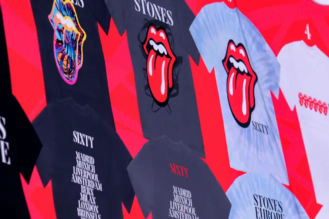
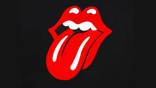
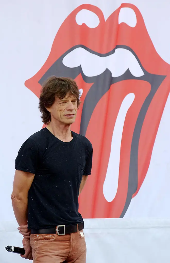
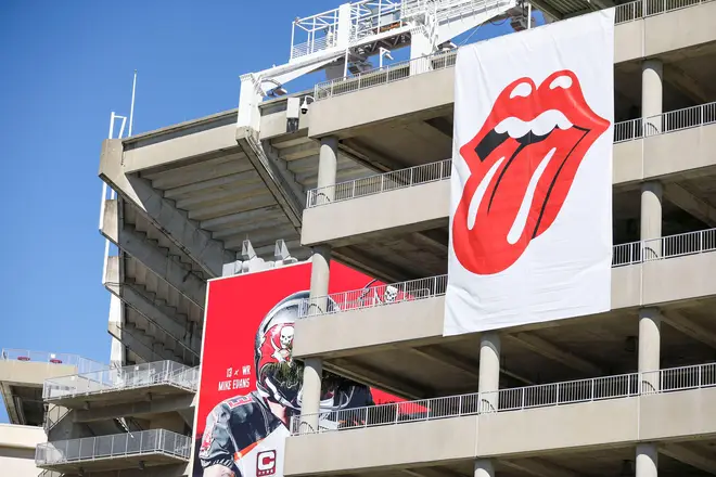
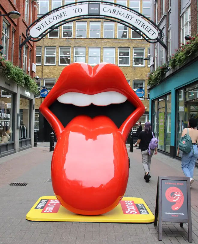
Take a look at the Rolling Stones logo. As far as corporate branding for a rock band goes, it’s unbeatable. For 50 years, the gaping mouth and tongue has symbolised the greatest rock ’n’ roll band in the world. A poll back in 2018 named the classic 1970s logo as their favourite t-shirt design. When you see it, you know you’re in for riffs, rock and something a little bit risque. The Stones logo has appeared on everything from t-shirts to silk ties, baseball caps to underpants.
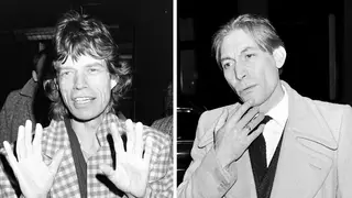
The tongue-and-lips logo is obviously - obviously - based on the unmistakable face of Stones frontman Mick Jagger. Isn’t it? Well… not exactly.
In April 1970, Jon Pasche was a 25-year-old student at the Royal College Of Art, when a call came through looking for a young artist to work on a poster for a forthcoming Rolling Stones tour. Jagger had seen Pasche’s designs at his final degree show that year, and he got the gig.
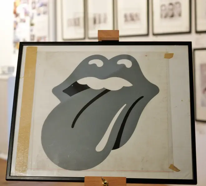
Pleased with his work, Jagger commissioned Pasche to come up with a logo for the brand new company Rolling Stones Records, which was being prepared to release the band’s material after they’d left their original company Decca.
Originally, the commission was for “a logo or symbol which may be used on note paper, as a programme cover and as a cover for the press book”.
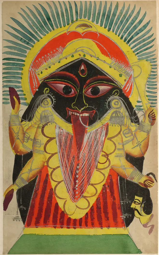
Jagger’s inspiration was a newspaper cutting that he’d seen that showed the Indian goddess Kali, with a pointed tongue, hanging down. In Hindu mythology, Kali symbolises death and time, but is also a powerful feminine figure.
Pasche told the V&A: “A lot of people ask me if it was based on Mick Jagger’s lips - and I have to say it wasn’t, initially. But it might have been something that was unconscious and also really dovetailed into the basic idea of the design. It was a number of things.”
The logo took Pasche about two weeks to finalise - working every evening - and he was originally paid the princely sum of £50.
However, it is reported he was paid a further £200 in 1972 and by 1984 Pasche sold his copyright of the logo to the Rolling Stones' commercial arm, Musidor BV, for £26,000.
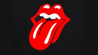
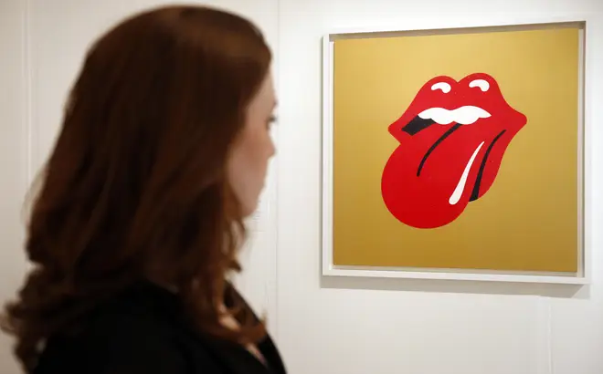
The Rolling Stones tongue and lips logo by Jon Pasche
The design first appeared on the album Sticky Fingers in April 1971, and has been used ever since.
Pasche thinks the design has stood the test of time because, “It’s universal statement, I mean sticking out your tongue at something is very ant-authority, a protest really… various generations have picked that up.”
And he admits, “When I’m out and about on holiday, it’s always a bit of a surprise when someone comes round the corner wearing a t-shirt or whatever!”
However, that's not where the story ends, Pasche isn't the only artist who's had a hand on the famous logo. The version that we know and love today was actually redesigned and trademarked by Craig Braun.
The owner and creative director of the Sound Packaging Corporation used the sketches of Pasche's logo to come up with the finished piece we see on their merch today, which sees two highlights on the tongue and more black used in the lips.

The tongue didn't stop it's journey there either, with the band commissioning Shepard Fairey in 2012 to update the logo for their 50th anniversary.

Read more:
- The 20 Best Rolling Stones cover versions
- Where did The Rolling Stones get their name from?
- What did The Rolling Stones play at their legendary Hyde Park show in 1969?