Album covers that were changed for unusual reasons
20 July 2024, 15:00
Radio X looks at the times the cover art has been messed with - for censorship, taste or more obscure reasons...
Content Warning: this article contains subjects and images some people may find offensive.
-
Guns N'Roses - Appetite For Destruction
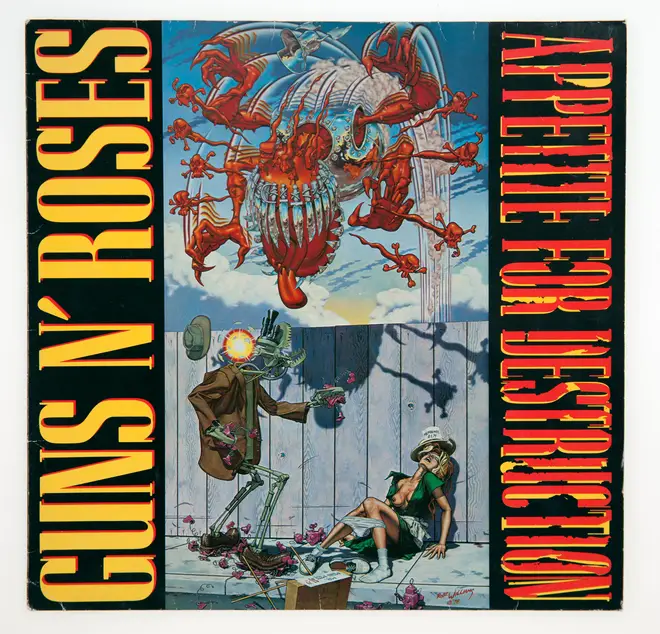
If you bought GNR's debut album upon its release in July 1987, your copy would feature this painting by American artist Robert Williams, also titled Appetite For Destruction.
Produced in 1978, the picture sees a woman selling toy robots on a street; she has been sexually assaulted by a humanoid robot, dressed in a dirty raincoat. Meanwhile, another mechanical figure looms up into the sky, presumably about to extract terrible vengeance on the criminal, who looks up to see his nemesis approaching, which causes his electronic brain to explode.
The controversial Appetite for Destruction album cover featuring art by Robert WIlliams. Picture: Alamy Williams was a veteran of the underground Zap Comix of the 1960s and his painting ended up on a postcard that was seen by an up and coming musician called Axl Rose. "This was not for the general public. This was never to go in people's homes," the artist explained to Entertainment Weekly. "It's an overdone cartoon for people who like underground comics and understand underground art."
When Williams was approached by Rose about using the painting as Guns N'Roses' debut album cover, the artist suggested they pick another, more palatable example of his work, but Rose and his agent were undeterred: they wanted Appetite For Destruction.
"I gave them a four-by-five transparency and the price that I'd give a sh*tty punk-rock band," Williams told Revolver in 2010. "A few weeks later, they called me up and asked if they could use the name. They couldn't come up with a name for the album, I guess, so that's how Appetite for Destruction came into our vernacular."
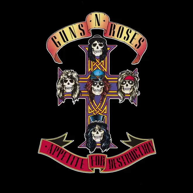
Billy White Jr's design for a GNR tattoo that later ended up as the cover for Appetite For Destruction. Picture: Press Geffen's president Eddie Rosenblatt told the LA Times that the band saw the artwork as "a symbolic social statement, with the robot representing the industrial system that's raping and polluting our environment".
However, the company hedged their bets and also released a significant amount of copies with alternative artwork by GNR associate Billy White Jr, which featuring a design originally intended as a tattoo, depicting the band members as skulls.
Stores could stock one or the other, but it was the "tattoo" version that quickly became the most common one, and was used for a vinyl reissue in 2008. White died in July 2023, with guitarist Slash paying tribute: "You will be missed."
-
David Bowie - Diamond Dogs
The opened out cover of Diamond Dogs with art by Guy Peellaert, minus canine testicles. Picture: Alamy Bowie's 1974 album certainly wasn't "the dog's b*llocks" as the half-man, half-canine hybrid of Belgian artist Guy Peellaert's cover painting had its knackers airbrushed out for British audiences. For later reissues, for example the 1990 "Sound + Vision" repressing, he testicles are all present and correct.
-
The Rolling Stones - Beggars Banquet
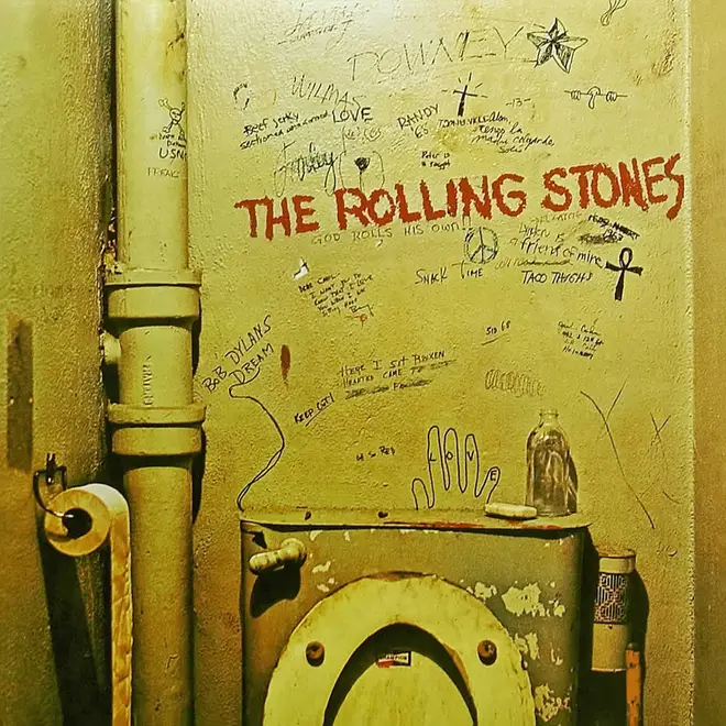
The original idea for the cover photo for the Stones' 1968 album was to feature the "banquet" of the title - the band dressed in elaborate costumes, lounging at a medieval feast. However, Mick Jagger went off the idea and instead came up with the notion that the sleeve should bear a toilet wall, graffitied with the band name, album title and the names of all the songs.
The Rolling Stones - Beggars Banquet: the band's choice. Picture: Press Reputedly shot in the toilet of a Porsche dealership in Los Angeles, the band's label Decca were horrified at the image and refused to release the LP in the summer of 1968 as intended.
"It was simply an idea that had not been done before," said Mick. "We chose to put the writing on a lavatory wall because that’s where you see most writings on walls. There’s really nothing obscene there except in people’s own minds."
A deadlock ensued between the record company and the musicians, and it wasn't until December that the album finally appeared, with the sleeve now bearing a fake dinner invitation. It wasn't until the 1980s and the CD era that the original bog-based art was used.
The Rolling Stones - Beggars Banquet: the label's choice. Picture: Alamy -
The Strokes - Is This It
The UK edition of Is This It by The Strokes: contains buttocks. Picture: Press America couldn't, er, face the naked rear end of the original UK album cover, so the NYC band's debut was dressed in the most un-Strokes-like design ever conceived.
The US edition of Is This It by The Strokes: buttock-free. Picture: Press -
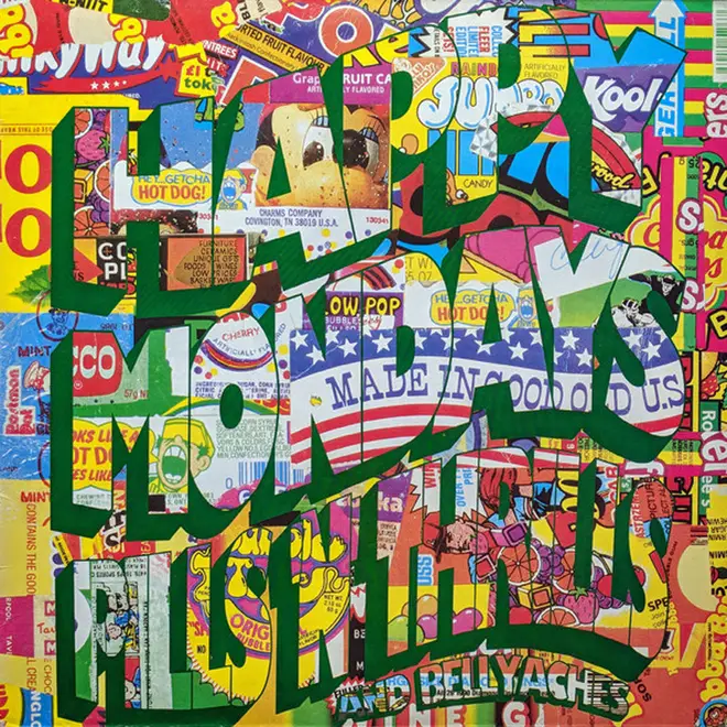
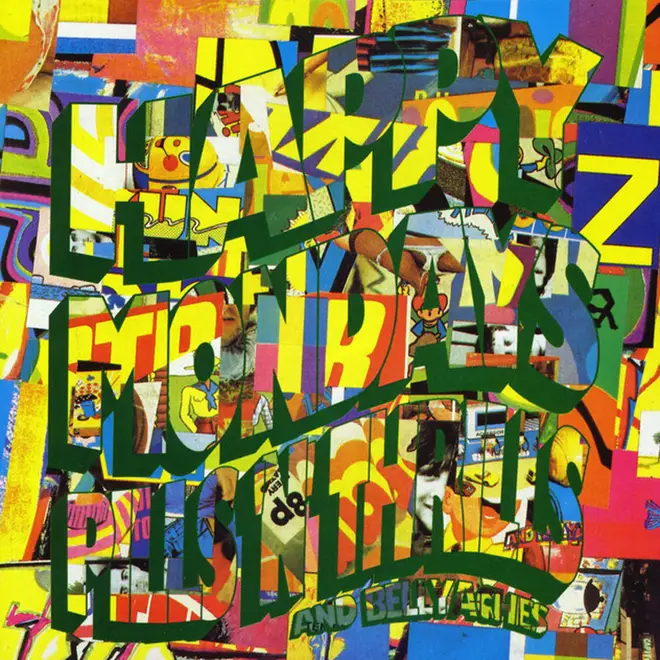
Happy Mondays - Pills 'N' Thrills & Bellyaches
Happy Mondays - Pills 'N' Thrills & Bellyaches - the copyright-troubling original. Picture: Press It wouldn't be a Happy Mondays album without some sort of legal bother - for their third outing in 1990, their regular collaborators Central Station Design created a collage for the front cover featuring various sweet wrappers. Try and see how many you can spot! This immediately ran into legal issues with the owners of the sweeties in question, so a less-contentious version was quickly pressed into service.
Happy Mondays - Pills 'N' Thrills & Bellyaches - the revised version. Picture: Press -
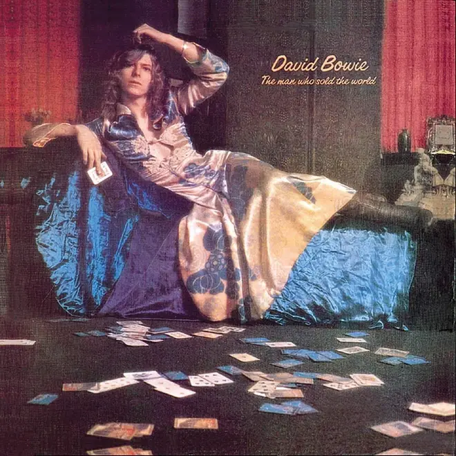
David Bowie - The Man Who Sold The World
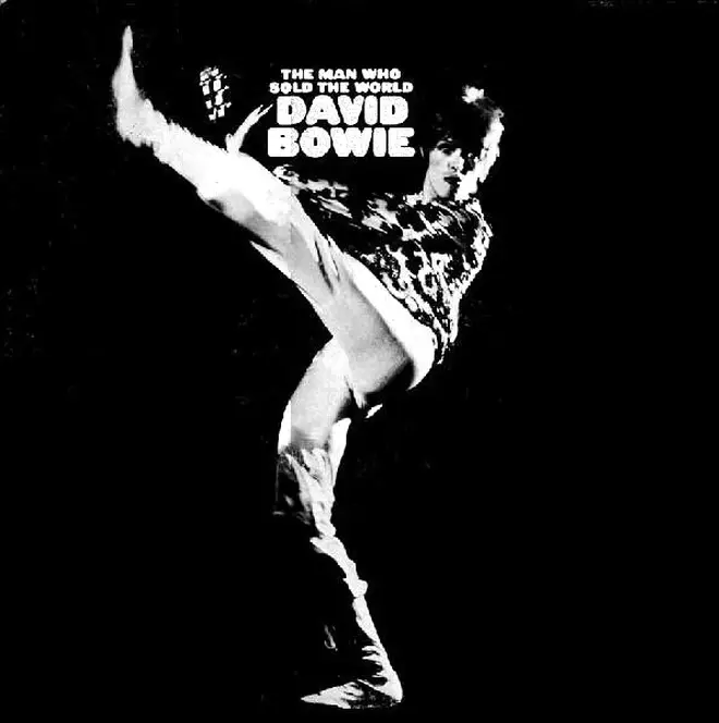
David Bowie - The Man Who Sold The World: MAN IN A DRESS. Picture: Press A lot of people were taken aback by the sight of Bowie reclining on a chaise lounge in a "man's dress", especially the American label who rejected the shocking (for 1970) image. They used a cartoon instead. When Bowie had become a superstar in 1972, the album was reissued with a black-and-white glam-era shot of the musician.
David Bowie - The Man Who Sold The World: MAN IN TROUSERS. Picture: Press -
Pink Floyd - Relics
Pink Floyd - Relics: 2D version. Picture: Alamy Drummer Nick Mason drew the intricate pen-and-ink artwork for this 1971 collection of tracks. When the album was remastered in 1996, designer Storm Thorgerson created a 3D model of the contraption and photographed that.
Pink Floyd - Relics: 3D version. Picture: Press -
Kraftwerk - Autobahn
Kraftwerk - Autobahn: Deutsches plattenalbum design. Picture: Press The original edition of this landmark piece of electronica featured a charming painting of the titular highway, complete with both ends of the German motoring experience: VW Beetle on one side, Mercedes on the other. The UK version went for a more graphical approach, which was later adapted for vinyl reissues in the 2010s.
Kraftwerk - Autobahn: British album artwork. Picture: Alamy -
The Beatles - Yesterday And Today
The Beatles - Yesterday And Today "butcher" cover: what were they thinking? Picture: Alamy The Fab Four collaborated with photographer Robert Whitaker on a series of weird "pop art" photographs, but one of the series was plucked out of the set and plonked on the latest collection of pop tunes for teenagers - without any context our explanation. Retailers recoiled from the grotesque image of "dead babies" and raw meat, so the "Butcher cover" was hastily withdrawn with a more boring design.
The Beatles - Yesterday And Today: the boring alternative. Picture: Alamy -
The Jimi Hendrix Experience - Electric Ladyland
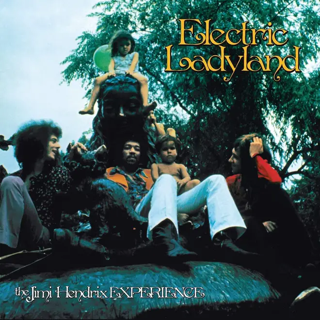
For his third album (and the last studio outing to be issued in his lifetime), Hendrix asked for a tasteful photo of the band - including bassist Noel Redding and drummer Mitch Mitchell - as taken by Linda McCartney. However, for reasons unknown, Track Records in the UK decided to create a sleeve with a photo by David Montgomery featuring nineteen naked women lounging around, discreetly covered by previous Hendrix record covers.
Too rude for Jimi? The "nude women" version of Electric Ladyland, released in the UK. Picture: Alamy Some stores refused to stock the album, ad Jimi himself thought that the photo was a bit crass. In the US, the album appeared with a photo of the guitarist, onstage at the Saville Theatre in London.
The US edition of Electric Ladyland. Picture: Alamy Modern versions of the album have literally gone back to the drawing board - and feature the Linda McCartney photo that was intended all along.
The Jimi Hendrix Experience, photographed in New York's Central Park by Linda McCartney. Picture: Press
