On Air Now
The Chris Moyles Show 6:30am - 10am
16 September 2023, 12:00
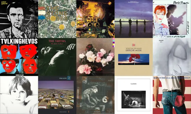
It was the decade when CD-sized covers began to take over, but the 80s still had some amazing sleeves. Here are a selection of the best.
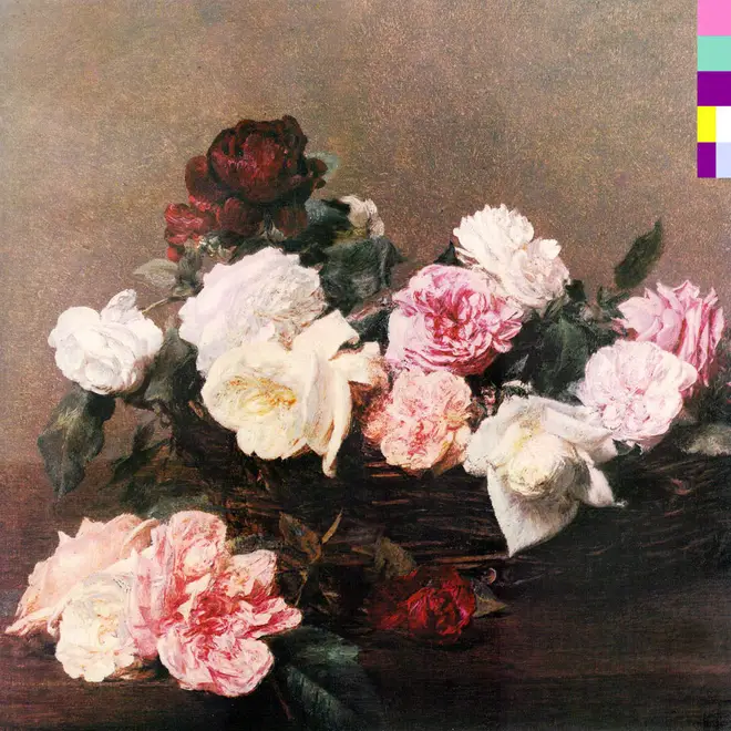
Factory Records' in-house designer Peter Saville had gone for a Futurist look for the Manchester band's debut album Movement, but for the follow-up, he wanted to combine the classical beauty of the music with the up to the date technology used to create it. To this end, he took the 1890 painting A Basket Of Roses by Henri Fantin-Latour and created a colour wheel that featured every tone in the artwork. Each letter then linked to a letter or a number, allowing the buyer to decipher the title and the band name - the cover blocks say "FACT 75", for example.
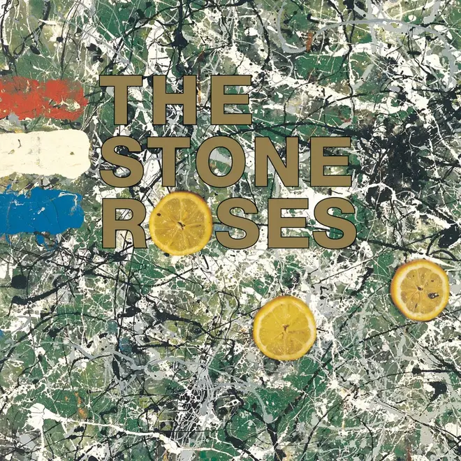
Roses guitarist John Squire was a talented artist and his paintings adorned the band's singles. For their debut album, a piece of art called Bye Bye Badman was pressed into service, with its Jackson Pollock-esque paint splatters forming a backdrop to the album's title. The slices of lemon - along with the title - are a reference to the student riots in Paris in 1968.

4AD label designer Vaughan Oliver had established a special working relationship with photographer Simon Larbalestier over the course of the Boston band's previous released, but for the band's second full-length album, they had an advance look at Black Francis's lyrics for the first time. This means that the sleeve - and the images in the inner booklet - perfectly sum up the grimy, quirky and strange world of the singer. The cover depicts the poor old Monkey Gone To Heaven, doomed to die through the global climate emergency.
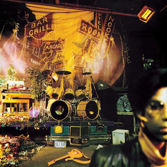
For his ninth album, Minneapolis superstar Prince got deliberately obscure. You can only see half of his face in the bottom right hand corner; the camera focuses on the elaborate stage set up behind him. Designer Laura LiPuma Nash later revealed the backdrop was borrowed from a production of the musical Guys & Dolls.
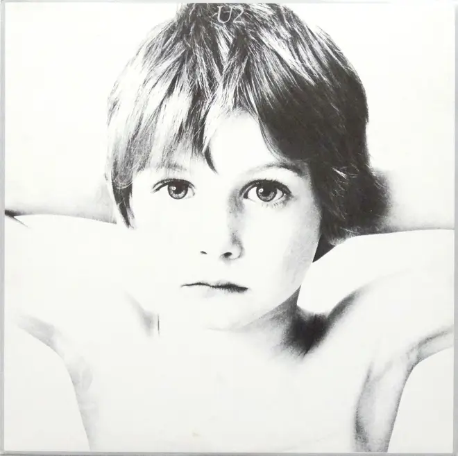
The Irish band's debut album features a stark black and white photo of Peter Rowen, the younger brother of Derek Rowen aka Guggi, a Dublin artist and member of The Virgin Prunes. Hugo McGuinness paid Rowen in Mars bars, but the innocence of the image was lost on the US arm of Island Records, who thought the picture might appeal to paedophiles; they changed it to a generic photo of the band members.
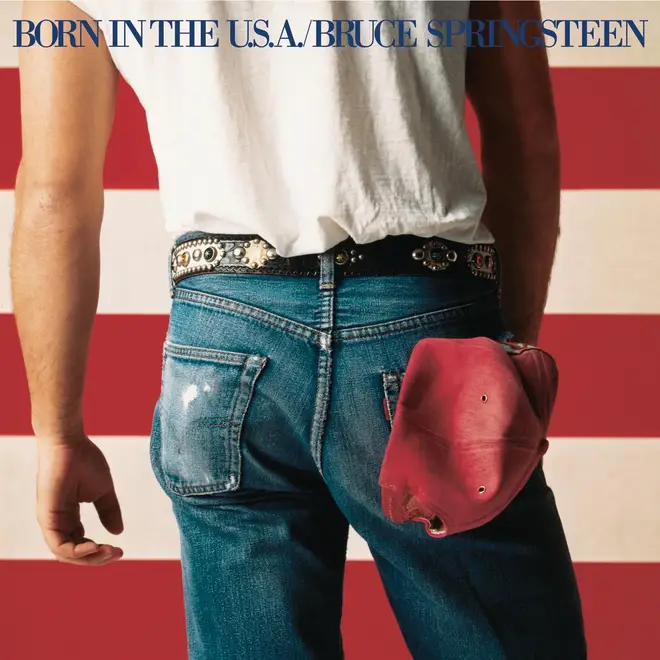
The Boss's song Born In The USA inspired photographer Annie Liebowitz to shoot a photo of Springsteen in front of the American flag; the track was a powerful lyric about soldiers returning from Vietnam. Some though that Bruce was weeing against the flag, but he insisted there was no hidden message in the image.
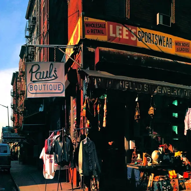
Licensed To Ill's crushed airplane is pretty funny, but we like the understated imagery on the 1989 follow-up. Jeremy Shatan took a panoramic photo of Ludlow Street in New York and while the real store was called Lee's Sportswear, the hip hop trio had made their own fictional "Paul's Boutique" sign.
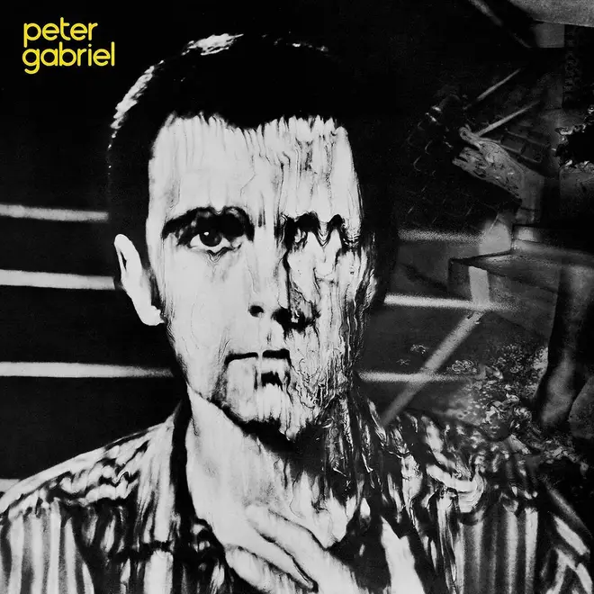
Pink Floyd designer Storm Thorgerson came up with a striking look for the former Genesis singer's third solo album. He took a Polaroid of Gabriel, who then started to squidge around the image before the print dried. The final result is suitably bizarre.
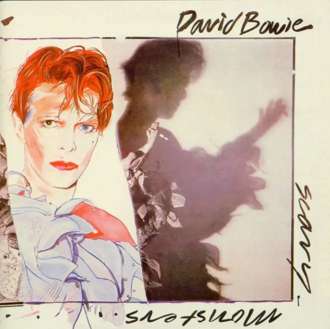
Artist Edward Bell created a collage of photos of Bowie as the Pierrot clown from the Ashes To Ashes video (taken by Brian Duffy), a painting of the same and, on the flip, cuttings from previous albums from the superstar. If you were lucky to see the David Bowie Is exhibition, you'll have seen the original artwork, which is MASSIVE.
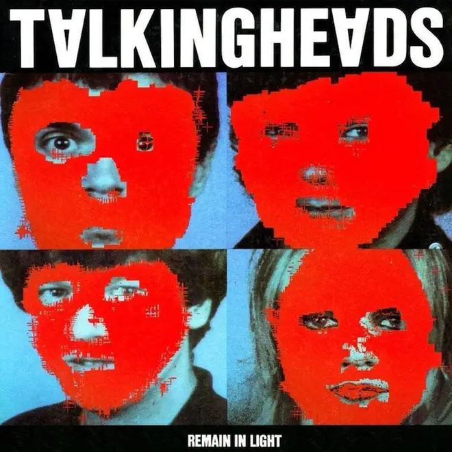
The New Yorkers produced one of the first computer-generated record sleeves, when they collaborated with the Massachusetts Institute of Technology's media lab to blot out sections of photos of the four band members with a horrible red colour.
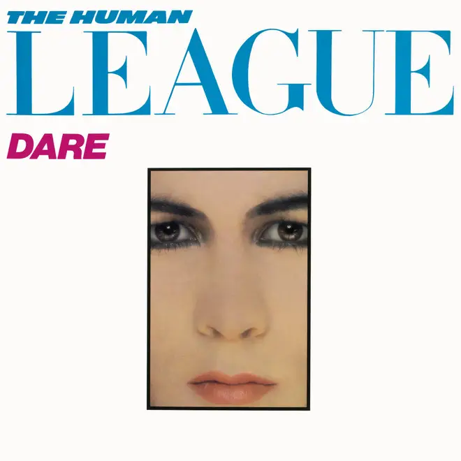
Philip Oakey wrote the lyrics to the Number 1 hit Don't You Want Me based on a story in a women's magazine and the idea carried through to the sleeve. The typeface and the vignette of Oakey's face (carried through to the reverse and the inner gatefold) pay homage to the classy world of fashion mag Vogue.

Designer Peter Saville found some images in an art magazine, taken by photographer Bernard Pierre Wolff in Genoa's Monumental Cemetery of Staglieno. The way Wolff shot the tombstone images fooled the eye - were they statues or real people? Saville showed the magazine to the young Manchester band, who picked one for their new album cover and one for their next single Love Will Tear Us Apart. When singer Ian Curtis killed himself in May 1980, Saville was concerned that the image would appear to be in bad taste - the band claimed that Curtis had been present during the meeting, so the cover art stayed.
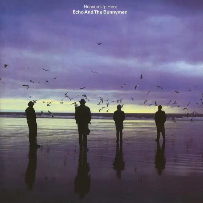
Brian Griffin took a photo of the Liverpool band on the beach at Porthcawl in South Wales during a break in recording for their second album.
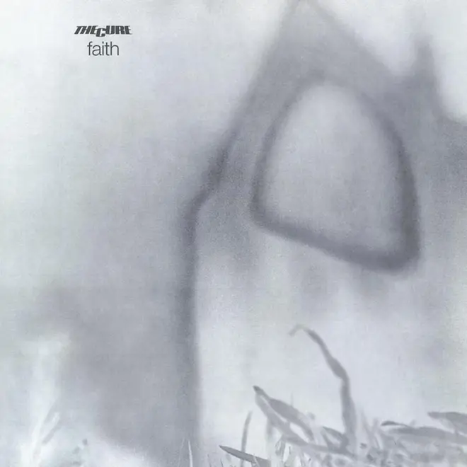
Photographer Andy Vella took this photo of Bolton Abbey in Yorkshire at the request of frontman Robert Smith, who knew the building from his childhood. Vella and his design partner Porl (now Pearl) Thompson manipulated the images so the holy building appears misty and grey - the ideal setting for the sombre music within the sleeve.
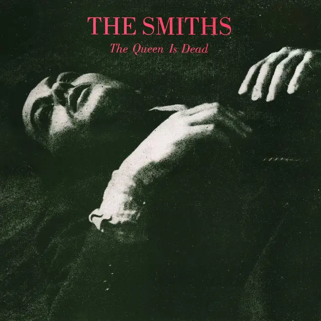
The third Smiths album features a shot of the French-Swiss actor Alain Delon, taken from the 1964 film L'Insoumis (aka The Unvanquished), dressed in bottle green with pink lettering.

Designer Martyn Atkins came up with the idea of the loudspeaker in a public place as a way of reflecting the Mode's sixth album. The cover features the blaring speakers in the Peak District, while the inner sleeve shows the set-up in different locations. The first single from the album, Strangelove, features a close-up of the equipment with the catalogue number BONG 13 sprayed on it.

This album may have annoyed founder member Roger Waters - who had left the group two years previously, thinking that was the end of The Floyd - but it was a huge seller anyway and came in a typically imaginative Storm Thorgerson sleeve. The photo was taken in the pre-PhotoShop days, meaning all those beds had to be physically made and plonked on the beach. Incredible.